
A logo identifies your brand among a sea of competition for your clients. It encompasses the flare and attitude of your image and puts a visual name to an entity. Every logo starts with a complete blank canvas and is completely unique to each client. No templates allowed. We want you to stand out.
Complete vinyl van wrap design with logo for a fleet of plumbing vehicles used throughout Ventura County. Colors used to stand out when driving through town and to coincide with logo use. Minimal white lines used in logo and throughout van to indicate a clean piping system.
ZeeWafel was a true passion project being one of Holland’s best dutch delicacies and utilizing a part of my own last name. The owner wanted their logo to represent a part of Holland as well as their hometown of San Diego (where the product is being sold). Thus the entrance of the swimming mermaid holding a stroopwafel and a wavy oceanic font. Mmm Stroopwafels…
Trailhead Physio is a Physical Therapist company with a specialization in bike fitting and cyclists. With the owners love of the Pacific Northwest, the logo had to reflect the Washington outdoor scene and add a touch of modernness without that standard outdoor badge look. A triangle was the missing piece!
Symmetry Mats is a brand of geomtric phi yoga mats (picture coming soon) that aide and facilitate one’s journey towards balance. The logo needed to represent the basis of symmetrical lines alongside the owner’s core interests of earthly plains. The finalized logo utilizes the letters S and M into a mountain structure made of unique triangles.
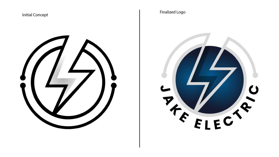
Jake Electric is an Electrician from Thousand Oaks serving all of Ventura County. The logo had to stand out on vehicles and work shirts from it’s competition in the county. The lightening bolt punches through the inside circle and utilizes an electric blue gradient with its attached top circuitry and finalizing with the company name surrounding the bottom.
Beijer Workstations is a custom furniture design company that specializes in desks for music studios. Working for high-end music producers, the logo had to stand out and showcase its most common client request - custom made desks to implement keyboards flush inside the unit. Utilizing the letter B/piano idea and turning it on its side (the proper way a piano and “B” should lie) finished off the piece alongside corresponding text to label the company.
Logo design for printed merchandise to be used for brand recognition in South Korea. Company represents the artistic side of learning English by incorporating all artforms in the logo name. This concept needed to be boldly addressed while still representing a playful atmosphere being catered towards kids and young adults. Since the singer/dancer silhouette represents the first two verbs of the name, the added speaking bubble on the bottom was used to complete the piece and bring attention to “and Speak English”.
Logo design for a 14 year old country music singer/songwriter that needed a secondary visual representation aside from her face. Logo represents young country with the two different fonts that blend together as well as personal artist interest with the lace material incorporated in the bottom graphic. Completing the general circle of the logo’s entirety, a horseshoe dots the “i“ in “Lacie“ and allows negative space to fit a very subtle microphone pointing downwards.
Logo design for realty investment company in Ventura County. Logo represents simplicity for its older demographic clients with a splash of modernism for the owner’s personal interest. The colors used represent an enterprising outfit with a true black for the structure and a subtle green gradient for the core.
Logo design, menu, and business cards for hairstylist in Ventura County. Branding is composed of a woodland theme with owner’s favorite fall colors added throughout. Logo represents the face of an animal using shears as the eyes and nose backed by a straight line forming a mountaintop behind the custom graphic.
Logo refresh for private golf club to commemorate 30th anniversary for all new printed merchandise in pro shop. Logo emphasizes name of club and 30th anniversary by arching on top and bottom. Location of course is shown on state of California by a subtle custom location marker in the shape of a flag on the green.
Live from Gibson Drive wanted a two part logo series for the production team to implement on their live videos and advertisement flyers. The production logo got treated with a bit more of nostalgic microphone feel with faders designed onto the graphic, while the Live logo had a more current neon and cursive look to fit with their live weekly released videos.
Thin Client Point of Sale is a software company that stores user data on a cloud-based server. The logo had to include a server graphic alongside some sort of global representation. The initial circle around the servers represented the movement around a globe which then got replaced by the clients desire for an actual globe. The red color was another request needed from the client which also got implemented in the subtle space between the cylinder shapes of the server.