


Harbor Freight Tools has an annual national retail convention in which teams and their managers from all over the country get together to discuss how they can strengthen their highly successful retail brand. The convention needed its own branded logo, printed signs, and brochures that conveyed their communal message and served as a directional means for the large amount of traffic that attended.
Logo design represents the central meaning of the convention. Something new outside of the traditional Harbor Freight Tools logo but still works to blend in with the branding of black and white photographs of hardworking Americans that were used throughout.
Vinyl flags were designed for outside directions and global branding. Each flag was originally designed with a different background photo and corresponding icons which then got simplified into a lightly textured background with a white grunge text.
Over 30 vinyl signs were designed and used throughout the entire convention for directional purposes. All were created using the new logo and branded with the same typeface and grunge work.
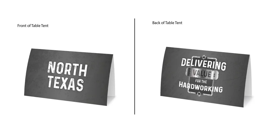
66 total table tents were designed for table distinguishment among attendants. Same grunge text was used on one side while the custom logo was on the other.
We’ve all seen them. Maybe even still get excited when they come in the sunday paper. These single page handouts were designed for employee merchandise that was sold at the convention’s gift shop.