
WEBSITES
Digital portals into a company’s presence. Whether a single landing page or a vast multi-page directory, the collection of sites below are custom catered to show a first look and/or an extension of a business

Accuride Into the Wild Overland Landing Page
Landing page for a client of Accuride that uses its slides in a minimalist offroad trailer. The page’s purpose is to introduce the product and host as another medium to get clients directed to Accuride’s main website. The page is styled in Accuride branding with an added splash of ruggedness to coincide with the theme of ITWO.

Infographic / Parallax Feature
Infographic used to bring relevant information to the forefront that's easy and fun to read. Background is a diamond plate textured mountain with trees lining the top to bring in an outdoorsy and rugged feel. To top it off, the sun moves up and down when scrolling through the page to bring an extra added sparkle to the whole piece.

Rugged Edge Slide Feature
To continue with the ruggedness feel, an invisible mask was laid over the edges of the top slide to appear torn and feathered. Into the Wild Overland prides itself for all its upgraded features (like Accuride slides) that are listed. The ultimate goal achieved was blending these features alongside Accuride products.


Simi Valley Home Brew Website
Complete website and eCommerce shop dedicated to selling beer and wine-making ingredients and equipment. Simi Valley Home Brew was a pre-existing physical location that underwent a major face lift creating some serious buzz that needed a site to match it’s new look. With over 3,000 pieces of homebrew equipment, ingredients and apparel, SVHB is one of the largest and efficient sites created by Dutchy Designs. Branding traditional beer colors with easy to use navigation, the site continues to sell product on a weekly basis and receives continuous traffic spikes from all over Ventura County and beyond.

Shop Directory
Something that doesn’t get as much credit as it deserves in website design is organization. This shop in particular had to be categorized into 10 large categories with different functions and purposes in each category.

Purchasing Page
One thing to never forget, when it comes to eCommerce sites, is making the buyers journey as simple as possible. They land on a clean looking background with just their product (and information about it), ready to add to cart.


Hanmar Website
Complete website build dedicated to reaching metal manufacturing customers in the Los Angeles area. Hanmar dates back to the 50’s as the company had been passed on from generations and focuses on an old trade that is signature to their brand - metal spinning. By focusing that as the trade mark function along with incorporating their vast equipment list, they’re industry presence is now even stronger and able to reach a global range of industries.
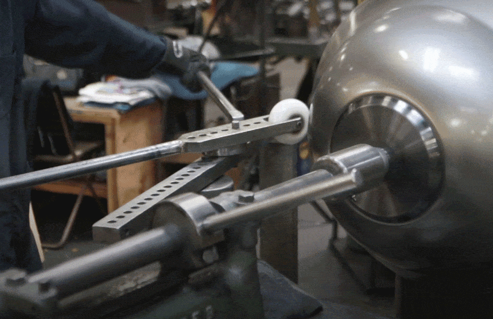
Metal Spinning Animated GIF Hero
Animated GIF’s are a great way to bring subtle movement to an image. Placing this constant spinning metal formation behind the company’s logo moves it to the background and visually describes what the company specializes in.
Custom Service Icons
Custom icons are another great way to achieve instant understanding of the service or product you sell. In this case, the dotted lines are visually describing how each type of machine forms or creates the metal formations.


Symmetry Mats Website
Complete and simple 5-page eCommerce website dedicated to selling and embellishing a unique grid-printed yoga mat. Being a brand new product, the majority of the site was utilized to easily click and buy as well learn more about what the mat is and how it can prove to be influential in all daily exercises (besides yoga).

Custom Description Graphics
Two important factors needed to be stressed visually so extra design measures were taken. Hand placement on the grid needed to be shown so new possible clients understood the idea of the mat instantly. Also the entire mat concept revolved around the Phi (Golden) Ratio so I included another visual understanding of that particular seashell looking graphic over the mat and showing how all the lines connect.

Superimposed CTA Product Placement
Being a product that is already widely used, yoga mat stock photography is pretty easy to find in some AMAZING contexts. Working with the owner, we were able to find 5 images that were absolutely loved and superimpose the product into the image. After already utilizing the first two images on the home page, the remaining 3 were then used as CTA’s for extra help calling out the important concept of that particular page.


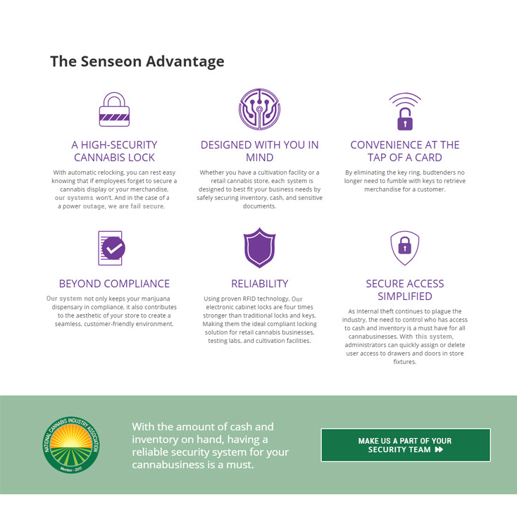
Cannabis Security Locks Landing Page
Landing page to attract customers in the security realm of cannabis shops. This page's purpose was to explain how the system works and why it is catered to high end boutique style businesses. It's styled with purple for luxury and emphasizes on the green to coincide with the product it’s being catered to.

Informational Icon Cabinet
Right below the hero jumps into an easy-to-read diagram of what the system can do for people in the industry. Remembering this is a locking system built into the cabinets, the product itself wouldn't make an attractive image to sell. Instead, the benefits are immediately listed with corresponding customized icons.
In-Depth Iconography
Further down the page, the benefits are reintroduced in a more in-depth display. The icons themselves are a bit more detailed and bolder to showcase a more tech-specific section. This area was intended for readers who want to further their knowledge on how the technology is being used.


Argan Wedding Website
One page site dedicated for people to RSVP and find out more information on lodging and all other details of the big day. The style was completely dedicated and branded towards the couple's shared interest of wine and music. Subtle background engagement photography complimented the bold typefaces with personalized messages on each slide.